 Skip to content
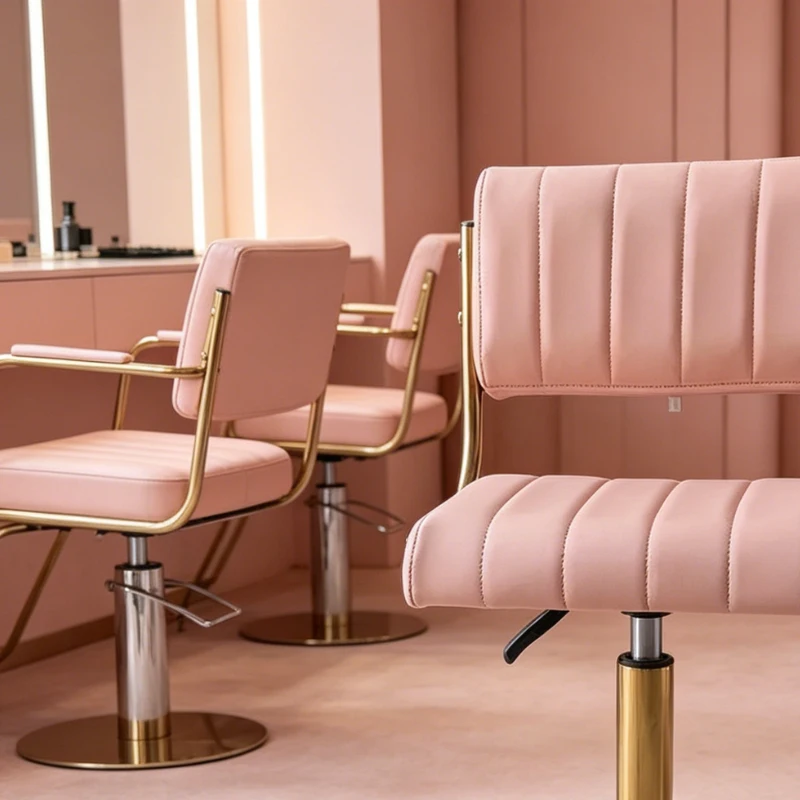
Pink works in salon design when it is controlled, not when it is applied for visual impact alone. It can influence how a space feels, how long clients stay, and how the brand is perceived, but only if it does not interfere with daily operations.
For salon owners, the goal is not to follow a trend but to introduce color in a way that supports workflow, comfort, and long-term consistency.

Why Pink Is Becoming a Smart Choice for Salon Spaces
Pink is being reintroduced into commercial interiors because it adjusts the emotional temperature of a space without reducing clarity or structure. Unlike stronger colors, it can sit between neutral and expressive depending on saturation and material.
In salon environments, this makes it useful for softening first impressions, reducing visual fatigue during long appointments, and creating a more welcoming atmosphere without affecting task precision.

How Pink Affects Client Experience and Salon Revenue
Pink improves client comfort when it is used in low to mid saturation ranges. This matters because clients in salons often remain seated for extended periods, especially during coloring or treatment services.
- It reduces perceived tension during long sessions
- It encourages clients to stay relaxed in waiting and treatment zones
- It makes the space easier to recognize and photograph, supporting social visibility
For most commercial setups, dusty rose and neutral blush tones perform best because they create warmth without distorting how surfaces and hair colors are perceived under LED lighting.
Where to Use Pink in a Salon Layout Without Overdoing It
Pink performs differently depending on the zone. It should be applied based on function rather than preference.
Reception and waiting area
This is the most effective place to introduce pink because it shapes the first impression without affecting technical work.
- Use low-saturation pink on walls or seating within the main visual field
- Keep flooring and fixtures neutral to maintain structure
- Pair with warm lighting to avoid the color appearing washed out

Styling stations
Pink should be controlled in areas where visual accuracy matters.
- Apply pink to chairs or limited wall accents rather than full surfaces
- Keep pink at least 1–2 meters away from mirror reflection zones when possible
- Avoid high-saturation tones, as they can shift perceived hair color under bright lighting
Shampoo and treatment zones
Pink is highly effective here because comfort is the priority.
- Use pink upholstery on shampoo beds or treatment chairs
- Select coated or sealed materials that resist water and product exposure
- Warmer tones help reduce client stiffness during longer sessions
Retail and display areas
Pink can guide attention without overwhelming product visibility.
- Use it behind shelving or as a backdrop for featured items
- Combine with directional lighting to highlight product edges
- Avoid layering multiple pink tones that compete with packaging colors
Which Pink Shades Work Best for Different Salon Areas
Not all pinks perform the same way in a commercial setting. The shade determines whether the space feels calm, bold, or distracting.
- Dusty rose works well for seating and treatment equipment because it remains stable under different lighting conditions
- Barely-there pink is close to neutral and suitable for walls and narrow corridors
- Clay or earthy pink pairs effectively with wood and industrial materials
- Magenta or saturated pink should be limited to small accents or focal elements
As a rule, the more technical the task in a zone, the more neutral the pink should be.
How to Use Pink Without Making Your Salon Feel Overdesigned
Pink should follow a controlled distribution rather than a dominant theme.
- 60 percent neutral base such as white, gray, or natural wood
- 30 percent pink through furniture or selected architectural elements
- 10 percent accents such as textiles or display details
In smaller salons under 80 to 100 square meters, keeping pink below 25 percent helps maintain openness and prevents color compression. In larger layouts or VIP rooms, the proportion can increase slightly without affecting spatial clarity.
Should Pink Be Used on Walls or Furniture in a Salon
Furniture is usually the more reliable way to introduce pink in a commercial setting because it allows color to be controlled, replaced, and scaled without affecting the entire space.
- Upholstery provides consistent color across different zones
- Replacement cycles are shorter than repainting or remodeling
- Cleaning and maintenance can be managed at the product level
In larger salon projects, operators often standardize color across key equipment categories to maintain visual continuity. Manufacturers such as NovaBeauty typically support this with coordinated upholstery options across shampoo units, styling chairs, and treatment beds, which helps reduce sourcing inconsistencies and simplifies long-term upgrades.
How Materials and Finishes Change the Look of Pink in a Salon
Material choice determines whether pink feels controlled or overly decorative.
- Matte leather or coated fabrics create a stable and easy-to-clean surface
- Velvet or textured finishes add depth but should be limited to low-contact areas
- Matte paint or plaster reduces glare under strong lighting
- Wood, metal, and stone act as grounding elements that balance the color
In high-traffic zones, lighter pink upholstery can make residue more visible, which supports cleaning efficiency but requires consistent maintenance planning.
Common Mistakes That Make Pink Look Unprofessional in Salons
Most issues come from applying pink without considering function.
- Using high-saturation pink across large surfaces
- Placing pink within mirror reflection zones where color accuracy is critical
- Ignoring lighting temperature, which can shift pink toward orange or gray
- Selecting materials that stain easily under chemical exposure
- Overusing pink without enough neutral contrast
Avoiding these mistakes ensures that pink supports both operations and brand perception.
How to Add Pink to Your Salon Without a Full Renovation
A gradual approach allows you to test the impact before committing to larger changes.
- Introduce pink through towels, cushions, or retail displays
- Add a single painted wall or arch behind a non-critical workstation
- Replace a limited number of chairs with pink upholstery
- Adjust lighting to a warmer temperature range to enhance the effect
This approach minimizes disruption while providing measurable feedback from both clients and staff.
Final Thoughts – Making Pink Work for Your Salon Brand
Pink works best when it is treated as a controlled design element rather than a visual theme. Its value comes from improving comfort, supporting brand identity, and shaping how clients experience the space without interfering with daily operations.
The most effective approach is to start with one controlled application, evaluate how it performs in real conditions, and expand only when it proves consistent in both appearance and usability.
For larger upgrades, working with suppliers that can deliver coordinated materials and color consistency across equipment categories helps ensure that design decisions remain practical, scalable, and aligned with long-term operational needs.